Page 16 - Jackson, WY Overlay Design Guidelines
P. 16
FAÇADE DESIGN
               Design Intent:
               The design of a building façade greatly impacts how it is perceived and
               its relationship to the street and site. The arrangement, rhythm and
               proportion of elements like windows and doors are all important factors.
               The overall composition of a wall is also important. Facades should have an
               orderly rhythm of elements that break down the building into discernible
               components. A larger building wall should be designed with smaller
               components to establish a human scale and add visual interest.

               Area 1 & Area 2 Design Guidelines:
               1.16  Design a building to incorporate a “base, middle, cap” to divide a
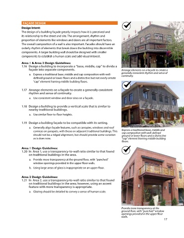
                    façade into separate components.                              Arrange elements on a façade to create a
                                                                                  generally consistent rhythm and sense of
                    a.  Express a traditional base, middle and cap composition with well-  continuity.
                       defined ground or lower floors and a distinctive but not overly ornate
                       “cap” element framing middle building floors.

               1.17  Arrange elements on a façade to create a generally consistent
                    rhythm and sense of continuity.
                    a.  Use consistent window and door sizes on a façade.

               1.18  Design a building to provide a vertical scale that is similar to
                    nearby traditional buildings.
                    a.  Use similar floor-to-floor heights.

               1.19  Design a building façade to be compatible with its setting.
                    a.  Generally align façade features, such as canopies, windows and roof
                       cornices on parapets, with those on adjacent traditional buildings. This   Express a traditional base, middle and
                                                                                  cap composition with well-defined
                       should not be a ridged alignment, but should provide some variation   ground or lower floors and a distinctive
                       as is does now.                                            “cap” element framing middle building
                    B.                                                            floors.

               Area 1 Design Guidelines:
               1.20  In  Area 1, use a transparency-to-wall ratio similar to that found
                    on traditional buildings in the area.
                    a.  Provide more transparency at the ground floor, with “punched”
                       window openings provided in the upper floor walls.
                    b.  Using large areas of glass is inappropriate on an upper floor.


               Area 2 Design Guidelines:
               1.21  In  Area 2, use a transparency-to-wall ratio similar to that found
                    on traditional buildings in the area; however, using an accent
                    feature with more transparency is appropriate.
                    a.  Glazing should be detailed to convey a sense of human scale.


                                                                                  Provide more transparency at the
                                                                                  ground floor, with “punched” window
                                                                                  openings provided in the upper floor
                                                                                  walls.
                                                                                                              17

