Page 173 - Healdsburg, CA Citywide Design Guidelines
P. 173
Signs
        Signs are important design features in Healdsburg that bring
        attention to businesses, provide information about the City
        and direct visitors to their destination. Balancing functional
        requirements for signs with the objectives for the overall character
        of an area is a key consideration. While signs are needed for a
        variety of reasons, an overabundance of signs in a certain area can
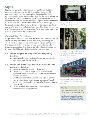
        be overwhelming and detract from the intent of installing signs.          Design a sign to be compatible
        Instead, the orderly location and design of signs can make fewer          with the primary building.
        and smaller signs more effective in an area. The design guidelines
        that follow provide key considerations for all sign types, as well as
        specific guidelines based on sign type.


        General Sign Guidelines
        A sign should be in character with the materials, colors and details
        of the building. Its content should be visually interesting and
        clearly legible. A sign should be located in a strategic location
        that does not obstruct the right-of-way or provide any safety
        issues for pedestrians, bicyclists or vehicles. Illumination sources
        for signs should be shielded to minimize glare and light pollution.
                                                                                  Use materials, colors and details
        6.69  Design a sign to be compatible with the primary                     that are compatible with those
               building.                                                          used for the building.
               a.  Use materials, colors and details that are compatible
                  with those used for the building.


        6.70  Design and locate a sign to be subordinate to a site
               and primary building.
               a.  Design a sign to be simple in character.
               b.  Design the content of a sign to be clearly legible.
                  Traditional block and curvilinear styles that are easy to
                  read are preferred.
               c.  Limit the number of colors used on a sign. In general,
                  no more than three colors should be used, although              Design and locate a sign to be
                                                                                  subordinate to a site and primary
                  accent colors and additional colors for illustrates may be      building.
                  considered.
               d.  Locate and design a sign to emphasize rather than
                  overshadow, building features.                                   NOTE
                                                                                   Signs are subject to Article IX in the
                                                                                   City of Healdsburg Land Use Code.

                                                                                   http://www.codepublishing.com/
                                                                                   CA/Healdsburg/#!/Healdsburg20/
                                                                                   Healdsburg2016.html#20.16.190


               Commercial, Industrial, Mixed Use and Large-Scale Multi-Family Development Design Guidelines Chapter 6  165

