Page 5 - Jackson, WY Overlay Design Guidelines
P. 5
DEFINING WESTERN CHARACTER
                                             This set of design guidelines further defines the term Western Character
                                             to add clarity to how it is interpreted for the design of new infill buildings,
                                             additions and other types of improvements within Area 1 and Area 2. The
                                             language below was derived from a public outreach process tasked with
                                             what Western Character meant to the community in regards to the built
                                             environment.

                                             Western Character is a broad set of characteristics that are a part of
                                             the design traditions of the community and that appear in a variety of
                                             earlier building types and styles.  It includes building forms, materials
                                             and details that may be combined in a variety of ways. As such, Western
                                             Character embodies an approach to design, not a specific style.

                                             These guidelines address the key design variables embodied in Western
                                             Character. The intent is to convey a sense of authenticity and not require
                                             using historical styles. The purpose is to avoid confusing the genuine
                                             history of the community with imitations of historic styles.

                                             Historic Precedents of Western Character

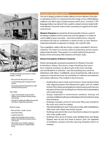
                                             Historic photographs document precedents for Western Character
                                             in downtown Jackson. They show a range of buildings that vary in
                                             form, materials and detail, yet all were part of the town’s heritage
                                             and contributed to its character.  Each early building had a sense of
            Traditional design precedents in these   relatedness with others. It exhibited a sense of authenticity, with practical
            images  include:                 responses to functional needs, the availability of craftsmen and materials,
                                             and climatic influences. This resulted in these features:
             • flat roof with decorative cornice
             • wood framing with stamped metal   •   Building forms were simple and functional. Some had false fronts
              panels
             • more ground level transparency with   with stepped parapets that followed the gable roof line hidden
              divided window panes                  behind. Others had exposed gabled or similar sloping roofs that were
                                                    key parts of their basic building forms. Details and ornamentation
            Top image                               were used sparingly.
             • upper level double-hung window   •   Designs responded to environmental conditions: Awnings and
              pattern with divided window panes     canopies sheltered walkways and sloping roofs directed snow away
              with lintels
             • storefront (although difficult to see the   from entrances.
              first floor is highly transparent)  •   Buildings conveyed a sense of community: They were oriented to
                                                    the street and scaled for walking.
            Bottom image                        •   Natural materials were used: These were muted, with matte finishes,
                                                    often even rustic. Many were locally sourced.
            • flat roof with -simple cornice
            • wood lap siding                   •   Buildings connected to the street: Storefronts and porches signaled
            • simple wood trim                      links to the public realm.
            • upper level double-hung window    •   Buildings had a sense of human scale: Building forms and design
             pattern with divided window panes      features were of sizes that relate to human scale. The repetition
             with lintels
            • decorative use of antlers appears     of storefronts, canopies and other openings along the street is an
             across the street on simple timber     example.
             fence


            6

