Page 7 - Jackson, WY Overlay Design Guidelines
P. 7
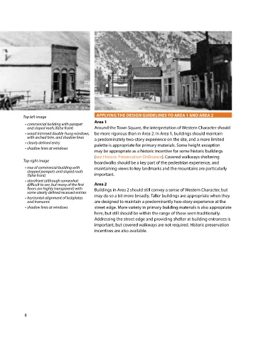
Top left image                    APPLYING THE DESIGN GUIDELINES TO AREA 1 AND AREA 2
                                             Area 1
             • commercial building with parapet
              and sloped roofs (false front)   Around the Town Square, the interpretation of Western Character should
             • wood trimmed double-hung windows,   be more rigorous than in Area 2. In Area 1, buildings should maintain
              with arched trim, and shadow lines   a predominately two-story experience on the site, and a more limited
             • clearly defined entry         palette is appropriate for primary materials. Some height exception
             • shadow lines at windows
                                             may be appropriate as a historic incentive for some historic buildings
                                             (see Historic Preservation Ordinance). Covered walkways sheltering
            Top right image                  boardwalks should be a key part of the pedestrian experience, and
             • row of commercial building with   maintaining views to key landmarks and the mountains are particularly
              stepped parapets and sloped roofs
              (false front)                  important.
             • storefront (although somewhat
              difficult to see, but many of the first   Area 2
              floors are highly transparent) with   Buildings in Area 2 should still convey a sense of Western Character, but
              some clearly defined recessed entries
             • horizontal alignment of kickplates   may do so a bit more broadly. Taller buildings are appropriate when they
              and transoms                   are designed to maintain a predominantly two-story experience at the
             • shadow lines at windows       street edge. More variety in primary building materials is also appropriate
                                             here, but still should be within the range of those seen traditionally.
                                             Addressing the street edge and providing shelter at building entrances is
                                             important, but covered walkways are not required. Historic preservation
                                             incentives are also available.


            8

